
What Is a Landing Page: Types, Features, and How to Create One
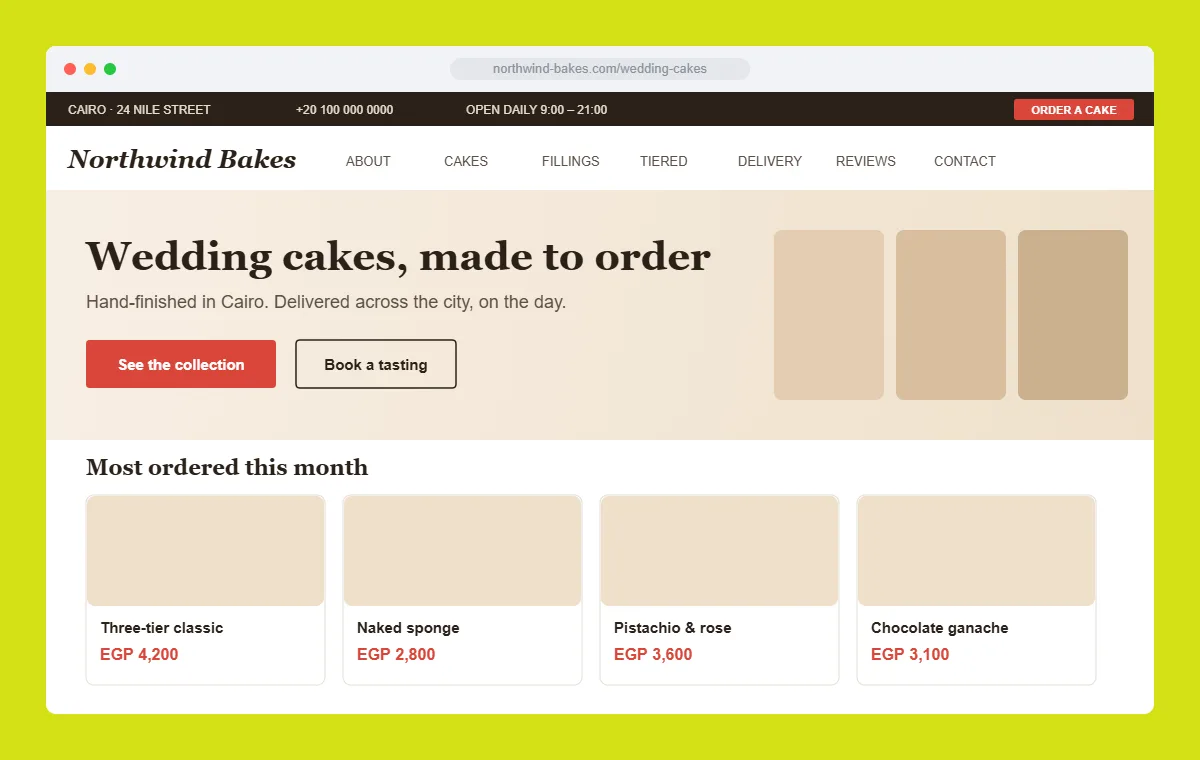
A landing page is a standalone web page built around a single goal: turning a visitor into a lead or customer. Unlike a full website, it strips away distractions and menus so that every headline, image, and button pushes the reader toward one action, whether that is filling out a form, booking a call, or buying a product. Because it is fast to build, cheap to test, and easy to tie to a specific ad or campaign, the landing page has become one of the highest-leverage assets in digital marketing.
Key takeaways
- A landing page is a single, focused page designed to convert traffic into a defined action, not to serve as a general-purpose website.
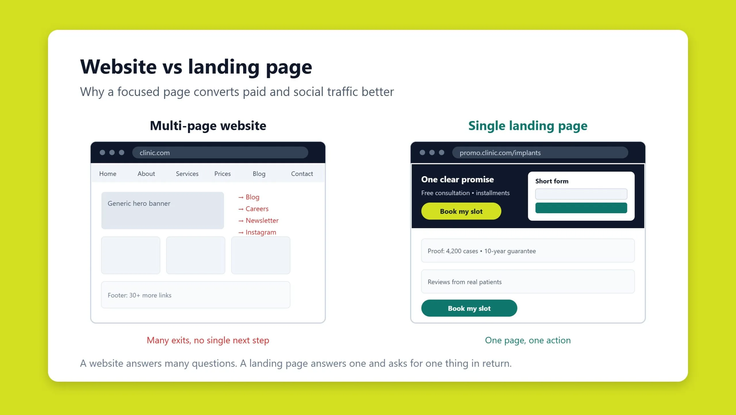
- It differs from a multi-page site and from a homepage by concentrating on one offer, one audience, and one call to action.
- Common types include lead-generation, click-through, sales (long-form), and coming-soon pages, each suited to a different stage of the funnel.
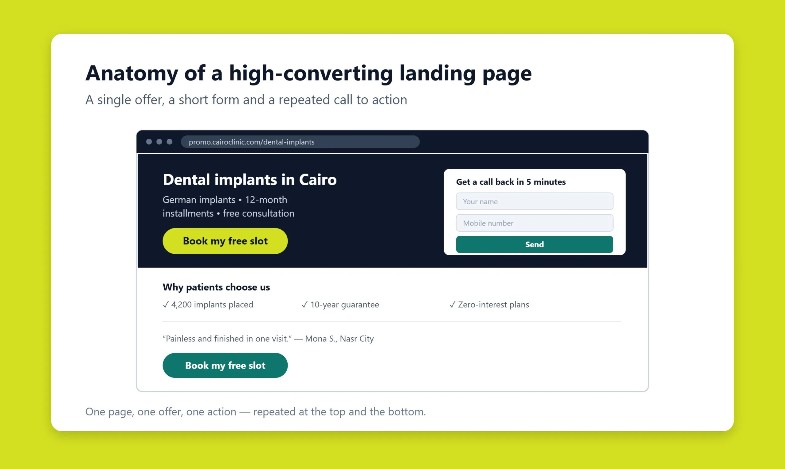
- High-converting pages share a clear anatomy: a strong headline, benefit-led copy, social proof, one prominent CTA, and a clean visual hierarchy.
- You can build a landing page with a no-code builder or a custom-coded design; both benefit from ongoing testing and paid traffic to reach their potential.
What a landing page actually is
A landing page is a self-contained web page created to capture a visitor’s attention and prompt one specific response. In everyday marketing language it is also called a lead-capture page, a conversion page, or simply a “one-pager.” Whatever the label, the defining trait is focus: the content, layout, and design all serve a single objective rather than trying to represent an entire business.
People rarely stumble onto a landing page by browsing. They arrive with intent, by clicking a search ad, tapping a link in an email, following a promoted social post, or scanning a QR code. That context matters. Because you usually know what brought the visitor there, you can tailor the message tightly to their expectations and remove anything that does not move them toward the goal.
The payoff is efficiency. A landing page is inexpensive to produce, quick to adjust, and simple to measure. If your main website struggles to convert, or you need to promote a new offer before a larger build is ready, a focused page can start generating results almost immediately.
Landing page vs. multi-page site vs. homepage
The clearest way to understand a landing page is to compare it with the things people confuse it with.
Landing page vs. a multi-page website
A traditional website juggles many jobs at once: a product catalog, a blog, company news, an about section, and a contact page, each living on its own URL. A landing page does the opposite. It solves one problem for one audience. That single-minded focus is what drives its conversion rate. A visitor is never asked to choose between ten paths; they are guided down one.
Landing page vs. a homepage
A homepage is a hub. It welcomes every kind of visitor and routes them onward, so it deliberately offers many options and links. A landing page is a destination. It is built for a particular campaign and a particular promise, which is why it usually hides the main navigation and keeps a single, repeated call to action. Sending paid traffic to a homepage instead of a dedicated landing page is one of the most common and costly mistakes in PPC and Google Ads, because the homepage dilutes the very intent the ad worked to create.
Types of landing pages
Landing pages are usually grouped by the job they do. Choosing the right type is the first step toward a page that performs.
Lead-generation pages
A lead-generation (or lead-capture) page exists to collect contact details, typically a name, email, or phone number, in exchange for something of value such as a guide, a demo, a quote, or a newsletter subscription. The form is the centerpiece. Outbound links are usually removed so the only meaningful action is to submit. Trust signals matter here: clear privacy assurances, recognizable logos, and testimonials all help a visitor feel safe handing over their information. A tightly related variant is the squeeze page, a minimal design aimed squarely at capturing an email address to grow a subscriber list.
Click-through pages
A click-through page has one job: warm the visitor up and send them onward, usually to a checkout, an app store, or a product page. There is no form. Instead the page uses persuasive copy, imagery, and video to build desire, then hands the visitor off with a single button. This style is common in e-commerce and software, where the actual transaction happens on the next screen.
Sales pages
A sales page, often long-form, gives the reader everything they need to make a purchase decision in one place. It layers benefits, objections, proof, pricing, and guarantees, then repeats the call to action at natural intervals as the visitor scrolls. Long-form pages suit products that need explanation, courses, memberships, higher-consideration goods, while shorter sales pages work for simple, familiar offers.
Coming-soon and viral pages
A coming-soon page builds an audience before a product or a full site exists. It teases the offer, captures early sign-ups, and creates anticipation for launch, an ideal companion when your main website is still in development. Related to it is the viral or content-led page, which persuades through helpful articles, entertaining videos, or interactive tools rather than a hard sell, with branding kept deliberately light.
Anatomy of a high-converting landing page
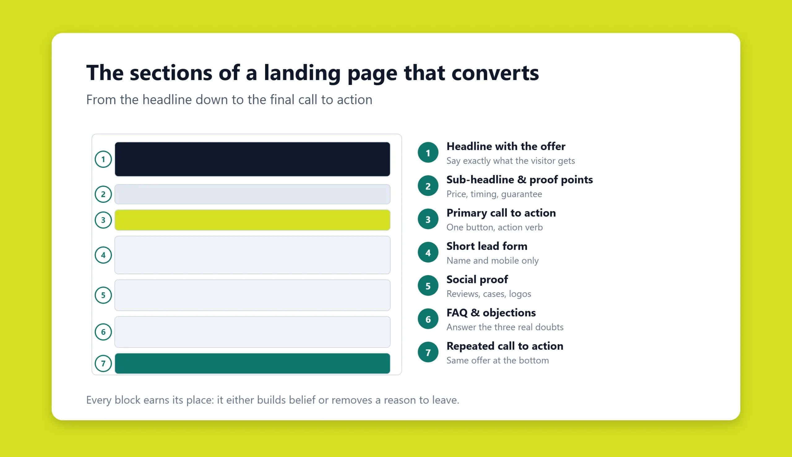
There is no single perfect template, but effective pages tend to share the same building blocks, arranged in a deliberate order.
- A benefit-driven headline. Within the first few seconds, the visitor should understand what you offer and why it matters to them. Keep it short, specific, and matched to the ad or link that brought them there.
- A supporting subheadline. One or two lines that expand on the promise and address the reader’s main question.
- A hero visual. A clean image, illustration, or short video that shows the product or the outcome, not decoration for its own sake.
- Clear, scannable copy. Benefits before features, written in the reader’s language. This is especially important for unfamiliar or premium products that need context to justify the ask.
- Social proof. Reviews, ratings, client logos, case results, or testimonials that reduce risk and build credibility.
- One prominent call to action. A single, unmistakable button with a short, action-oriented label. Repeating the same CTA down a long page is fine; competing CTAs are not.
- Trust and urgency elements. Guarantees, security badges, limited-time offers, or a countdown can nudge a hesitant visitor, as long as they stay honest and unobtrusive.
The governing principle is restraint. Every element should either move the visitor toward the goal or be cut. The days of flashing banners and clashing colors are long gone; modern pages win with white space, a strong visual hierarchy, and a frictionless path to the button.
How to build a landing page: builders vs. custom
There are two main routes to a live landing page, and the right one depends on your goals, budget, and how much control you need.
No-code builders and templates
Drag-and-drop builders such as Unbounce, Instapage, Leadpages, Carrd, and Webflow, along with page builders inside popular content management systems, let you assemble a page from ready-made blocks. They are fast, beginner-friendly, and packed with built-in A/B testing and analytics. For many campaigns, a builder gets you to a polished, publishable page in an afternoon. The trade-off is flexibility: you work within the platform’s structure, and heavily templated pages can start to look alike.
Custom-coded and CMS-based pages
When you need pixel-level control, unique branding, or tight integration with your existing stack, a custom build is worth it. Many teams pair a flexible CMS with a bespoke front end, for example a tailored page inside a WordPress build, or commission a fully custom web design when the page has to stand apart and scale with the brand. Custom pages take longer and cost more, but they remove the ceiling on performance and design.
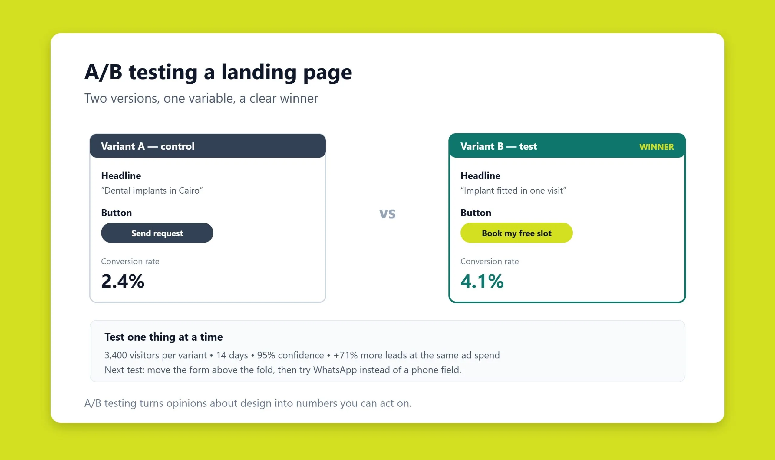
Whichever route you choose, the marketing fundamentals do not change: one offer per page, answers to the visitor’s questions above the fold, a logical and uncluttered layout, one clear action, and compelling copy backed by real proof. Then test relentlessly, headlines, images, form length, and button text can each swing conversions.
SEO considerations for landing pages
Landing pages are often powered by paid traffic, but they can and should earn organic visibility too. A page tied to a persistent offer, rather than a short-lived promotion, deserves proper optimization. Target a clear primary keyword and reflect it in the page title, meta description, headline, and URL. Because landing pages are thin by design, make the words you do use count, and support them with genuinely helpful content where it fits the goal, which is where strong content marketing and a coherent SEO strategy pay off.
Technical basics still apply: fast load times, mobile-first layouts, descriptive image alt text, and clean, crawlable markup. Page speed is doubly important here, since every extra second of load time erodes conversions on the paid side as well. If a page is purely a temporary campaign that you do not want indexed, handle that deliberately with noindex rather than by accident, and avoid orphaning evergreen pages that could rank.
Common landing page mistakes
- Too many goals. Asking a visitor to subscribe, buy, and follow you all at once splits their attention and lowers every conversion rate. Pick one.
- Message mismatch. When the ad promises one thing and the page delivers another, visitors bounce. The headline should echo the click that earned it.
- A weak or buried CTA. If the button is hard to find or vaguely worded, action stalls. Make it obvious and specific.
- Overlong or intrusive forms. Every extra field costs conversions. Ask only for what you truly need at this stage.
- Ignoring mobile. A large share of traffic arrives on phones; a page that is awkward to read or tap on mobile leaks leads.
- Launching and forgetting. A landing page is a starting point, not a finished product. Without A/B testing and iteration, you leave easy gains on the table.
- No traffic plan. Even a great page converts nothing without visitors. Pair it with paid campaigns, email, or search so the funnel actually fills.
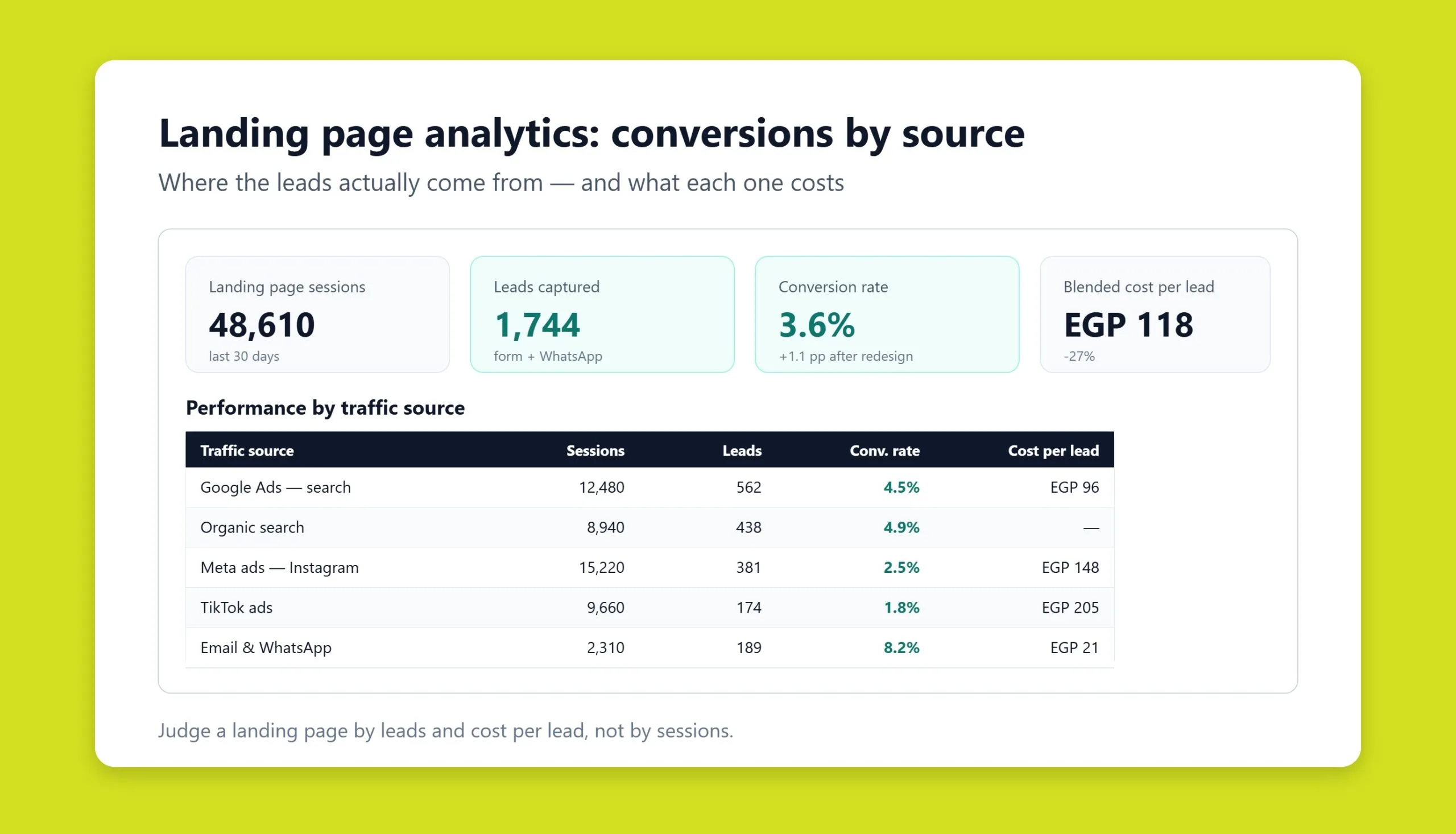
Done well, a landing page turns attention into measurable results. Even a modest conversion rate of a few percent, multiplied across a steady stream of well-targeted traffic, compounds into real revenue and a stronger brand. The craft lies in the discipline: one goal, one audience, one action, tested and refined until the numbers climb.
Landing pages that work in Arabic
The structure above holds in any language. Building the same page in Arabic introduces a set of failures that are easy to prevent and expensive to find after launch.
Layout
- Set the document direction, not just the text alignment. Alignment moves the words. Direction reorders the elements, which is what actually needs to happen.
- The visual entry point moves to the top right. A hero image placed left of the headline in English usually needs to swap sides.
- Directional icons mirror. Arrows, back controls and progress indicators point the other way. Icons that carry no direction, such as a play button, stay as they are.
- Check every element that mixes Arabic with prices, model numbers or English brand names. That is where ordering breaks.
The form
| Field | What goes wrong | Fix |
|---|---|---|
| Phone | Validation built for one country rejects valid regional numbers | Accept international format, default the country code by visitor location |
| Name | Latin-only validation rejects Arabic characters, or forces a first and last name split | Accept Arabic script, use a single name field |
| Postcode | Marked required, but not used in much of the region | Make it optional, add a landmark or directions field instead |
| Placeholders as labels | Harder to follow when the reading direction flips | Use visible labels above the field |
The call to action
The most useful regional change is to the destination rather than the design. In markets where messaging apps are the normal way to reach a business, a chat option alongside the form usually lifts total inquiries. Tag those clicks as conversions, otherwise your best-performing page will appear in analytics as the one people leave.
Frequently asked questions
What is the difference between a landing page and a website?
A website is a collection of pages serving many purposes, catalog, blog, about, contact, while a landing page is a single page built to drive one specific action. The landing page removes distractions and navigation so that all attention flows toward one goal, which is why it usually converts better than a general homepage.
Do landing pages need a separate domain?
No. A landing page usually lives on a subpage or subdomain of your existing site, or on a builder’s hosted URL. What matters is not the domain but the focus of the page and the quality of the traffic you send to it.
How long should a landing page be?
It depends on the offer. Simple, familiar, or low-cost actions convert well on short pages, while complex, premium, or high-consideration products often need long-form pages that answer every objection. Let the visitor’s questions, not an arbitrary word count, determine the length.
Can a landing page rank in search engines?
Yes, if it targets an evergreen offer rather than a fleeting promotion. Optimize the title, meta description, headings, and URL around a clear keyword, keep load times fast and the layout mobile-friendly, and support the page with relevant content. Temporary campaign pages can be set to noindex when you do not want them competing in search.
How do I drive traffic to a landing page?
Landing pages rarely attract visitors on their own. Feed them with paid search and social ads, email campaigns, and, for evergreen pages, organic search. Matching the message on the ad to the message on the page is what keeps that traffic converting once it arrives.
Related guides
Don't miss the chance to
make your website more visible!
Initial consultation and
audit of the current situation

Read also

Article Behavioral Factors in SEO: What They Are and How to Improve Them
Article JavaScript Links Are Hiding MENA Sites From ChatGPT and Claude

Article VOCTOS Is a Top SEO, PPC and SEM Company in Egypt on Clutch for 2026
Article Commercial Ranking Factors: The Complete List

Article The Title Meta Tag: What It Is and How to Write It
Article The Role of Meta Tags in Search Engine Optimization
Article Can You Sue an AI for Defamation? Where the Law Stands

Article Cloudflare’s 15 September AI Crawler Defaults: The Check Gulf and Egypt Brands Should Run Today




Real Results
More Wins
SEO & GEO for Delta Medical Labs
 GEO
GEO
1M+ monthly organic visits, 159,200 ranked keywords, 5,570 pages cited by AI engines, and 1,186 #1 rankings in KSA.

Arabic SEO, GEO & guest posting for VPNly
 SEO
SEO
65K peak monthly organic visits, 55 guest posts, and 149 pages cited by AI engines.

SEO & GEO for Ogaei Virtual Care
GEO
From 3 to 7,931 monthly organic clicks in 7 months, 2.9M+ impressions, and 40+ keywords in Google’s Top 10.

SEO for Eduverse
SEO
12× search traffic in 10 months, 45% of target keywords in the top 5, and 55% in the top 10.
Trusted by