
Website Navigation: What It Is and How to Use It

Website navigation is the system of menus, links, and interactive elements that lets visitors move from one page to another and find what they came for. Done well, it guides people to the right content in a few clicks, keeps them on your site longer, and helps search engines like Google understand and crawl your pages. Done poorly, it confuses users, inflates bounce rates, and buries important pages where neither humans nor crawlers can reach them.
Navigation sits at the intersection of user experience (UX) and search engine optimization (SEO). It shapes how easily a person completes a task and how efficiently a search engine maps the relationships between your pages. This guide explains what website navigation is, why it matters for usability, SEO, and crawlability, the main types you can use, and the practical best practices that make navigation genuinely helpful rather than decorative.
Key takeaways
- Website navigation is the combined set of menus, links, and controls that lets users move between pages and helps search engines crawl and understand site structure.
- Good navigation directly affects conversions and how deeply users explore, and it affects rankings through crawlability and link distribution.
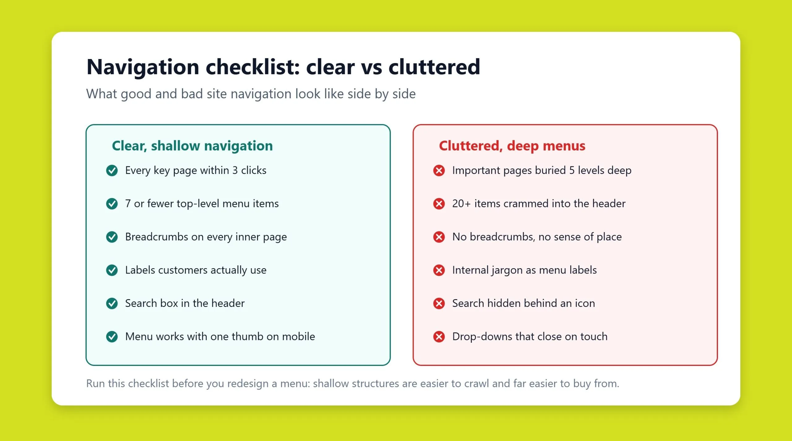
- Aim for the classic rule of thumb: any important page should be reachable in three clicks or fewer from the homepage.
- Core elements include the header menu, footer, breadcrumbs, sidebar, mega menus, and faceted (filter) navigation for e-commerce.
- Mobile navigation and internal linking are not optional extras; they are central to both crawlability and conversions.
- Consistency, clear labels, and a logical hierarchy matter more than visual novelty.
What website navigation is
Website navigation is the collection of techniques, patterns, and interface elements that, working together, let visitors move quickly from page to page. It is the connective tissue of a site: menus in the header, links inside your content, breadcrumb trails, filters in a catalog, a footer packed with useful links, and even the humble logo that returns you to the homepage.
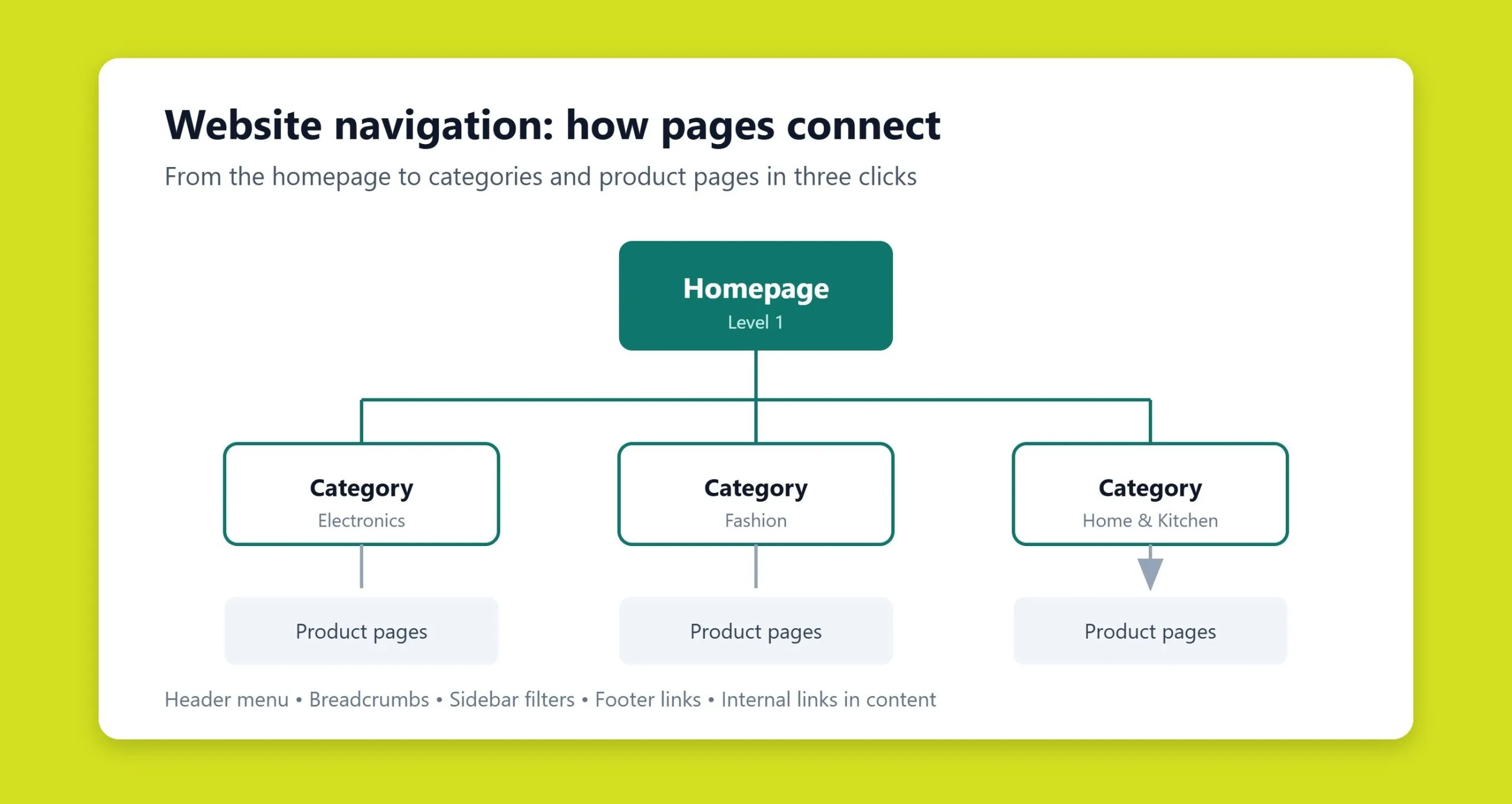
Structurally, you can picture a website as a directed graph. Each page is a node, and every link is an edge connecting two nodes. Navigation defines which edges exist and how easily a user or a search engine crawler can travel along them. When those connections are clear and deliberate, both people and machines can build an accurate mental map of your site. When they are tangled or missing, that map falls apart.
Three requirements define usable navigation. First, availability: navigation elements should appear on every page so visitors can always jump to the section they need. Second, clarity: menus and controls should be visible and intuitive, ideally putting any page within three clicks. Third, appropriate visual design: navigation should contrast with body text and backgrounds without clashing with the overall style, so people can spot it instantly.
Why navigation matters for UX, SEO, and crawlability
A well-planned navigation system is one of the strongest indicators of a usable website. Confusing paths and endless links disorient visitors and make it harder to find information, so people leave and choose a competitor instead. That behavior shows up in your own analytics: higher bounce rates, shorter sessions, and fewer completed goals.
User experience
From a UX perspective, navigation answers three unspoken questions a visitor always has: Where am I? Where can I go? How do I get back? When the answers are obvious, users feel in control, explore more pages, and are more likely to convert. Every extra click or moment of hesitation is friction that costs you engagement and revenue. This is exactly the kind of thinking that goes into custom web design, where structure and interface are planned around real user tasks rather than guesswork.
SEO and crawlability
Search engines rely on navigation just as much as people do. Googlebot discovers pages by following links, and your menus, internal links, and footer are the primary trails it uses to reach every corner of your site. If a page is not linked from anywhere in your navigation, it may go undiscovered, be crawled less often, or be treated as low priority.
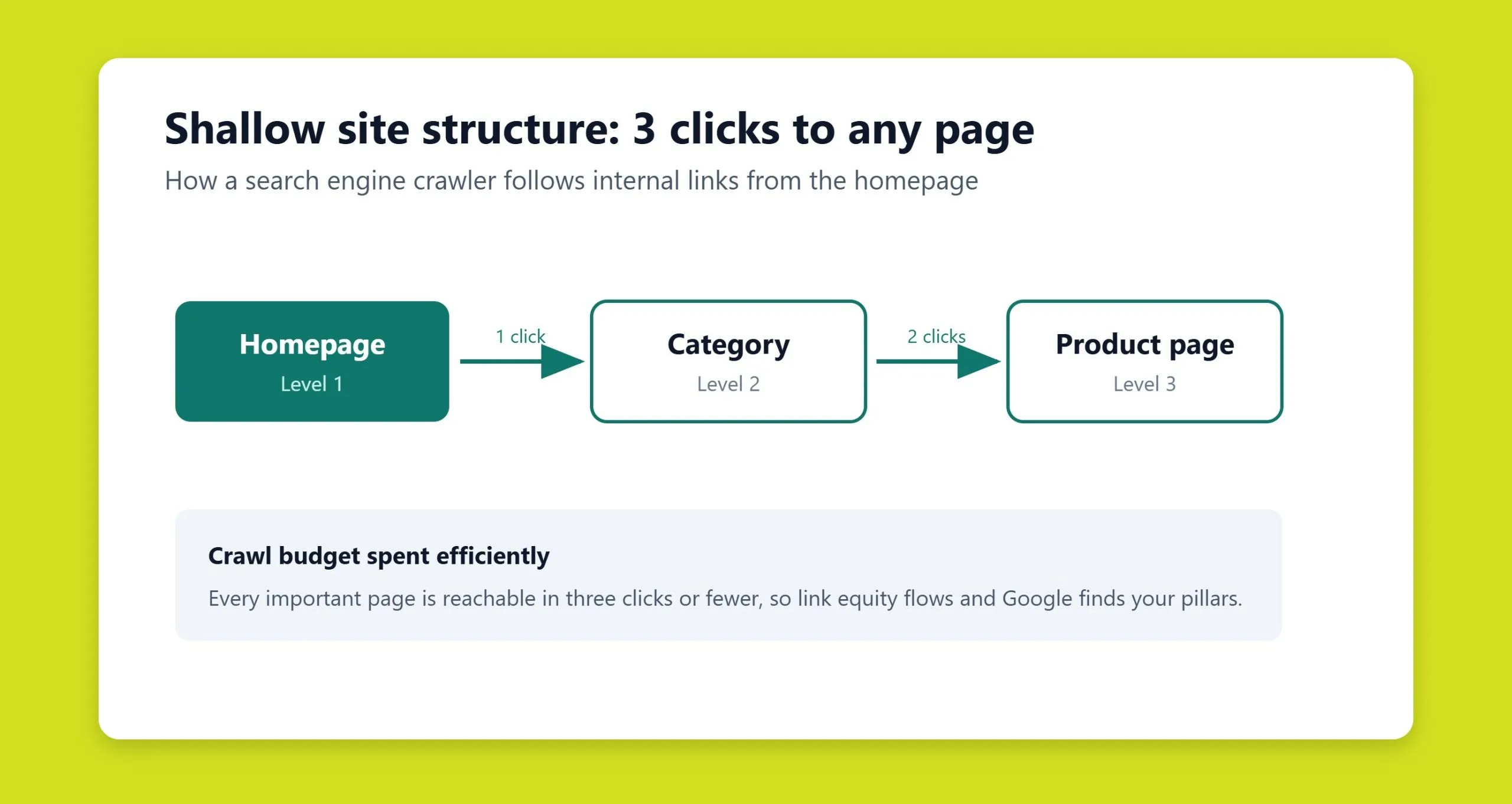
Navigation also communicates hierarchy and importance. Pages linked directly from the main menu signal priority; pages buried several levels deep signal the opposite. A shallow, logical structure spreads link equity efficiently and helps Google understand which pages are your pillars. Building a site with this in mind from day one, the goal of SEO-friendly websites, prevents the crawl and indexing problems that are painful to retrofit later. If your existing site suffers from orphaned pages or a bloated menu, an SEO audit is the fastest way to surface those issues.
Types of website navigation
There is no single correct navigation model. The right mix depends on your positioning, the volume of content, and your topic. Most sites combine several types, because the real goal is simply to make finding information effortless.
Header and main menu
The main menu, usually in the header, holds links to your top-level sections and is the anchor of the whole system. It can be horizontal (across the top) or vertical (down the side). When space runs short, dropdowns reveal subcategories on hover or tap. Keep the main bar to roughly five to seven visible items, not counting dropdowns; beyond that, comprehension drops and a secondary menu becomes the better choice.
Footer navigation
The footer is the area at the bottom of every page, and it does more heavy lifting than most people assume. Use it to duplicate the main menu, add secondary sections, and organize links into logical columns. It is also the right place for social profiles, detailed contact information, and legal or policy links, keeping them accessible without cluttering the header.
Breadcrumbs
Breadcrumbs are a secondary trail showing the path from the homepage to the current page, for example Home > Catalog > Laptops > Model X. Every item except the last is clickable. They tell users exactly where they are and how to step back up the hierarchy, and they help search engines understand structure. Place them below the main menu, show them on every page except the homepage, and highlight the final element (which matches the page title). Avoid piling on extra “Back” or “Next” links that only confuse people; breadcrumbs alone are enough.
Sidebar navigation
When sections split into subsections, a sidebar, typically on the left of the main content, is an effective way to expose them. You do not need to repeat the sidebar on every page; place it within the section it belongs to. Sidebars work particularly well for documentation, large blogs, and catalog categories.
Mega menus
A mega menu is an expanded dropdown that displays many categories, subcategories, and sometimes images or promotions in a single panel. Large retailers and content-heavy sites use them to surface a broad catalog without forcing users through multiple clicks. The trade-off is complexity: mega menus must be well organized and grouped, or they overwhelm rather than help.
Faceted navigation and filters
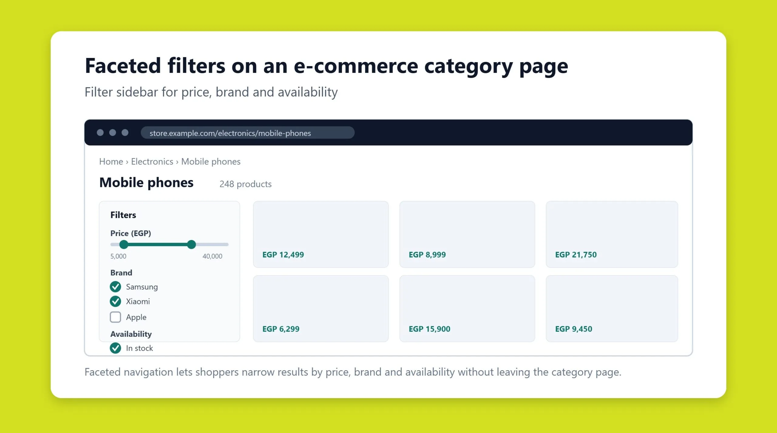
Faceted navigation, the filters and sorting controls common on e-commerce sites, lets users narrow a product list by attributes like category, price, availability, brand, or new arrivals. Most shoppers prefer a filter panel to the left of the product grid so they can set criteria first and then scan the results. Faceted navigation is powerful for users but must be configured carefully for SEO, since uncontrolled filter combinations can generate thousands of near-duplicate URLs that waste crawl budget.
Navigation best practices
Whatever combination you choose, a handful of principles separate navigation that helps from navigation that hinders.
Design a clear header
Set the header apart visually and include the essentials for your type of site: a logo (top left is the most familiar position, and it should link to the homepage), a tagline or short description if your logo alone does not explain what you do, key contact details, business hours, a cart link for stores, and a contact prompt if you can respond quickly. Resist adding social media links up here; they tend to pull visitors away before they engage.
Label sections with intent
Choose menu labels using the language your audience actually searches for. Labels such as Catalog, About, Reviews, Blog, Contact, Pricing, and Delivery should be self-explanatory. Clear labels reduce hesitation and reinforce topical relevance for search engines.
Make search easy to find
If your site has meaningful search, show the full search form, an input field plus a visible button, rather than a lone magnifying-glass icon that some users struggle to notice. Make the button obvious and easy to tap, use a large enough input to hold a two- or three-word query, and offer category scoping when you have many sections. The header is the best location, since that is where attention lands first.
Keep URLs clean
Keep URLs short, readable, and descriptive. A path like /laptops/ultrabooks/ tells both users and search engines what the page is about far better than a string of parameters. Clean URLs also make links easier to share and reinforce your site hierarchy.
Plan for scale
Design navigation with future growth in mind. Build menus with room to add items, and account for expanding content at the planning stage so the system stays coherent as the site grows. Retrofitting structure onto a site that has ballooned unpredictably is far harder than reserving space from the start.
Mobile navigation
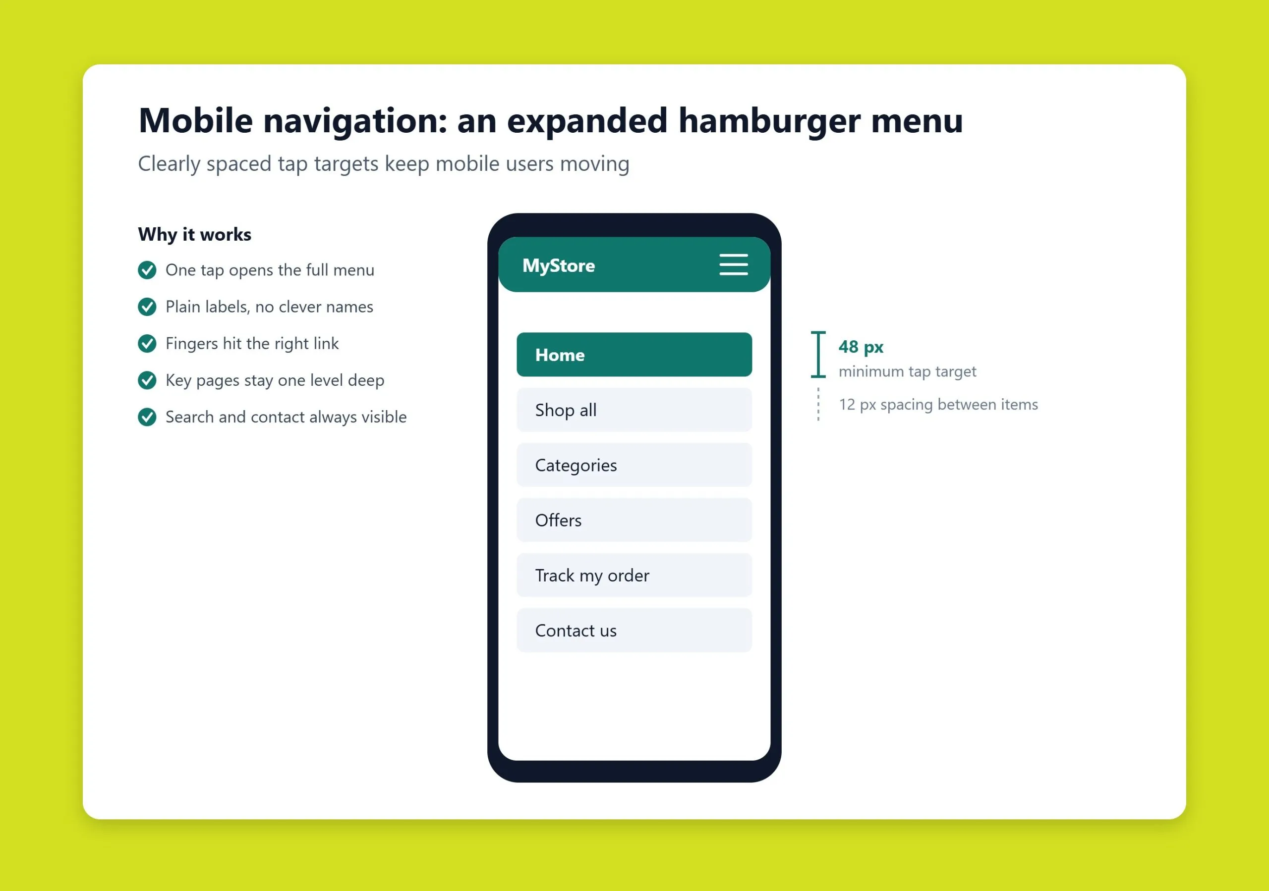
Most traffic now arrives on mobile, and Google predominantly uses the mobile version of your site for indexing, so mobile navigation is not a scaled-down afterthought; it is the primary experience. The universal pattern is the “hamburger” menu, a three-line icon that expands to reveal categories, borrowed from mobile design specifically to save screen space.
On small screens, a few adjustments matter more than usual. Make tap targets large enough to hit comfortably with a thumb, and space them apart so users do not trigger the wrong link. Avoid relying on hover effects, since they do nothing on touch devices; navigation states must work on tap. Keep menus shallow so users are not lost in nested layers, and make sure search and the cart (for stores) remain one tap away. Because mobile crawling drives indexing, the links exposed in your mobile navigation should mirror the important paths available on desktop, not a stripped-down subset.
Internal linking and site structure
Menus are only part of the picture. Internal links, the contextual hyperlinks inside your content, are one of the most underused navigation and SEO tools. They guide readers to related pages, distribute link equity to the pages that matter, and give search engines additional trails to crawl and additional context through descriptive anchor text.
Follow a few rules to keep internal linking effective. Use meaningful anchor text rather than a raw URL or a generic “click here,” so both users and search engines understand the destination. Make links visually distinct from surrounding text, and give them a clear hover or active state on desktop. Do not stuff paragraphs with excessive links; dense linking is hard to read and can look manipulative to search engines. Avoid placing links immediately next to each other without punctuation or spacing. And highlight already-visited links in a different color so returning readers do not retread the same pages.
Structurally, aim for a shallow hierarchy where the homepage links to primary categories, categories link to subcategories, and subcategories link to individual pages, ideally keeping everything within three clicks of the homepage. This flat architecture is easier for crawlers to traverse and spreads authority more evenly than a deep, buried structure. Common structural patterns include hierarchical (a tree branching from the homepage), hub-and-spoke (a central page linking out to related pages), and fully connected clusters where related pages all link to one another. Topic clusters, where a pillar page links to supporting articles that link back, are a modern, SEO-friendly application of these ideas. Getting this architecture right is a core part of professional SEO services, because structure influences rankings as much as content does.
Common navigation mistakes
A few recurring errors quietly undermine otherwise good sites.
- Too many top-level items. Cramming a dozen links into the main bar overwhelms users. Group them and move overflow into a secondary menu or the footer.
- Vague or clever labels. Creative names that only make sense internally force users to guess. Prefer plain, descriptive labels.
- Orphaned pages. Pages with no internal links pointing to them are hard for users to reach and may be crawled poorly or not at all.
- Deep burial. Important pages that take five or six clicks to reach lose both visitors and crawl priority.
- Inconsistent navigation. Menus that change position or contents from page to page break the mental model users build as they browse.
- Hover-only interactions on mobile. Effects that require a mouse leave touch users stranded.
- A dead-end 404 page. When someone lands on a missing URL, the error page should offer clear routes back to the homepage and key sections so the visit does not end there.
- Uncontrolled faceted URLs. Filters that generate endless crawlable combinations waste crawl budget and create duplicate content unless managed with canonical tags, robots rules, or parameter handling.
Fixing these issues is rarely a one-time job. As a site grows and its content evolves, navigation needs periodic review to stay coherent, which is where ongoing technical support keeps menus, links, and structure healthy over time.
Thoughtful navigation improves nearly every measure of a site’s quality. It influences how many visitors return, bookmark your pages, and become repeat customers. When links and structure are planned deliberately, loyalty and trust rise, conversions climb, and search visibility improves alongside them, because the same clarity that helps a person find your best page also helps Google rank it.
Navigation in Arabic: what changes when the page flips
Everything above applies to Arabic sites, with one addition that most navigation guides never mention. Arabic reads right to left, and a navigation system designed in English rarely survives the flip without breaking something. The failures are usually small, consistent, and easy to fix once you know where to look.
The direction attribute is not a styling choice
Setting text alignment to the right in CSS is not the same as setting the document direction. The direction attribute tells the browser how to order inline elements, where to place list markers, and how to handle mixed Arabic and Latin text in the same line. Without it, a menu item like “iPhone 15 الجديد” can render with the parts in the wrong order.
- Set the direction on the html element, not on individual containers, so it cascades correctly.
- Use logical CSS properties for spacing so padding and margins mirror automatically instead of needing a separate stylesheet.
- Test any element that mixes Arabic with numbers, prices, model names or English brand names. That is where ordering breaks.
Navigation elements that need mirroring
| Element | Common mistake | Correct behavior in Arabic |
|---|---|---|
| Breadcrumbs | Separator arrow keeps pointing right | The arrow points left, and the hierarchy runs right to left |
| Dropdown menus | Submenu opens to the right and runs off screen | Submenu opens to the left |
| Back and forward controls | Icons keep their Latin orientation | Directional icons mirror. Icons that are not directional, such as a play button, do not |
| Pagination | Page one sits on the left | Page one sits on the right |
| Sliders and carousels | First slide enters from the right | First slide enters from the left, matching the reading direction |
| Progress steps | Step one on the left | Step one on the right |
The SEO consequence people miss
Broken Arabic navigation is not only a usability problem. If your submenus fail to open, the links inside them may never be discovered by a crawler that does not execute the interaction, and internal pages lose the link equity they should be receiving. Check that every navigation link exists in the raw HTML, not only after JavaScript runs.
One more point for bilingual sites. If Arabic and English versions have different menu structures, users switching language often land on the homepage rather than the matching page. Map each page to its counterpart and send the language switch to that URL, not to the root.
Frequently asked questions
What is the difference between navigation and site structure?
Site structure is how all your pages relate to one another, the underlying map of categories, subcategories, and content. Navigation is the visible system of menus and links that lets users and search engines travel across that map. Structure is the blueprint; navigation is the set of doors and hallways that make it usable.
How many items should a main navigation menu have?
As a general guideline, keep the main menu to about five to seven top-level items, not counting dropdown subitems. Fewer choices are easier to scan and reduce decision fatigue. If you have more important sections than that, use dropdowns, a mega menu, a sidebar, or a secondary menu rather than overloading the main bar.
Do breadcrumbs help SEO?
Yes. Breadcrumbs improve usability by showing users where they are and how to move back up the hierarchy, and they help search engines understand your site structure. With the appropriate structured data, breadcrumbs can also appear in Google search results, making your listing clearer and potentially improving click-through rates.
Why is mobile navigation so important?
Most web traffic is now mobile, and Google predominantly uses the mobile version of a site for indexing and ranking. If your mobile navigation hides or omits important links, both users and search engines may fail to reach key pages. Mobile navigation should expose the same important paths as desktop, with tap-friendly targets and no reliance on hover effects.
What are orphaned pages and why do they hurt?
Orphaned pages are pages that no internal links point to. Because search engines discover pages by following links, orphaned pages may be crawled rarely or missed entirely, and users have no natural way to find them. Linking every important page from your navigation or from related content keeps them discoverable.
Related guides
Don't miss the chance to
make your website more visible!
Initial consultation and
audit of the current situation

Read also

Article Behavioral Factors in SEO: What They Are and How to Improve Them
Article JavaScript Links Are Hiding MENA Sites From ChatGPT and Claude

Article VOCTOS Is a Top SEO, PPC and SEM Company in Egypt on Clutch for 2026
Article Commercial Ranking Factors: The Complete List

Article The Title Meta Tag: What It Is and How to Write It
Article The Role of Meta Tags in Search Engine Optimization
Article Can You Sue an AI for Defamation? Where the Law Stands

Article Cloudflare’s 15 September AI Crawler Defaults: The Check Gulf and Egypt Brands Should Run Today




Real Results
More Wins
SEO & GEO for Delta Medical Labs
 GEO
GEO
1M+ monthly organic visits, 159,200 ranked keywords, 5,570 pages cited by AI engines, and 1,186 #1 rankings in KSA.

Arabic SEO, GEO & guest posting for VPNly
 SEO
SEO
65K peak monthly organic visits, 55 guest posts, and 149 pages cited by AI engines.

SEO & GEO for Ogaei Virtual Care
GEO
From 3 to 7,931 monthly organic clicks in 7 months, 2.9M+ impressions, and 40+ keywords in Google’s Top 10.

SEO for Eduverse
SEO
12× search traffic in 10 months, 45% of target keywords in the top 5, and 55% in the top 10.
Trusted by