

Best Tools for Testing Website Responsiveness (Mobile-Friendliness)
The fastest way to test website responsiveness is to run your URL through Google PageSpeed Insights and Lighthouse for scored diagnostics, then confirm the layout visually in Chrome DevTools device mode. Together these free tools tell you whether your pages render correctly on phones, load quickly, and meet the mobile-first standards Google now uses to rank every site.
More than half of all web traffic now comes from smartphones and tablets, and Google indexes the mobile version of your site first. That makes responsiveness a ranking factor and a conversion factor at the same time. A layout that breaks on a 375-pixel screen loses visitors before they ever read your offer. This guide explains why responsive design matters, how to test it properly, and which tools deliver reliable answers in 2026.
Key takeaways
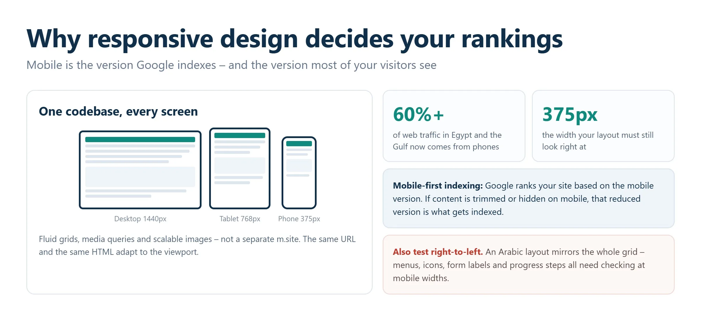
- Responsive design means one flexible codebase that adapts to any screen size using fluid grids, media queries, and scalable images, not a separate mobile site.
- Google uses mobile-first indexing, so the mobile rendering of your pages determines how you rank in search.
- Google retired its standalone Mobile-Friendly Test tool; use Lighthouse, PageSpeed Insights, and Chrome DevTools instead for the same signals.
- Combine a scored audit tool (PageSpeed or Lighthouse) with a visual tester (DevTools, Responsively, or BrowserStack) for a complete picture.
- Real-device testing on platforms like BrowserStack or LambdaTest catches issues that emulators miss.
- Responsiveness needs ongoing monitoring, not a one-time check, because every design change can break a layout.
Why responsiveness matters for mobile-first indexing and UX
Responsive design is a build approach where a single version of your site reshapes itself to fit the visitor’s screen. Flexible CSS grids and media queries rearrange blocks, resize typography, and adjust spacing based on screen resolution. Unlike a standalone mobile site on a separate subdomain, a responsive build uses one URL and one codebase, which is far easier to maintain and keeps your SEO signals consolidated.
Google completed its move to mobile-first indexing years ago. In practice, this means Googlebot evaluates and ranks your site based on how the mobile version renders, not the desktop one. If content, structured data, or internal links are missing or broken on mobile, your rankings suffer even for desktop searchers. A responsive site solves this by serving identical content and markup to every device.
The user-experience stakes are just as high. Visitors on phones abandon pages that force horizontal scrolling, hide navigation, or place tap targets too close together. Every one of those frustrations raises bounce rates and depresses conversions, which are behavioral signals search engines also watch. Responsiveness is therefore not a cosmetic detail; it sits at the intersection of technical SEO, UX, and revenue. If you want an expert to assess these signals across your whole site, a structured SEO audit is the most efficient starting point.
What a genuinely responsive site looks like
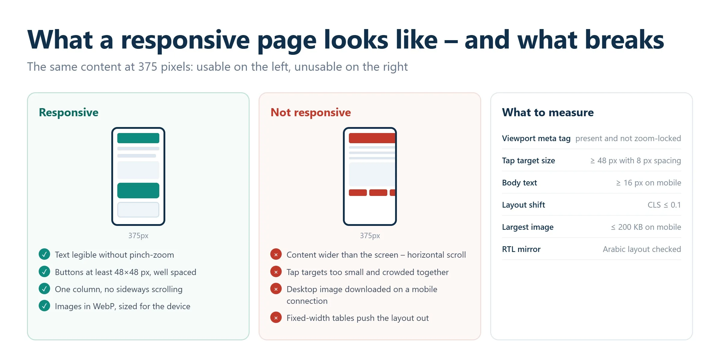
A properly responsive site meets a few clear criteria. Blocks reflow automatically to the viewport width thanks to fluid grids and media queries. Images scale without breaking the layout and use modern formats such as WebP or AVIF. Pages load quickly even on a throttled mobile connection. Navigation relies on large, thumb-friendly buttons and clear menus. Text is legible without pinch-zooming or sideways scrolling. Forms, buttons, and other controls are sized for touch. When any of these fail, the site risks losing both traffic and trust.
How to test website responsiveness
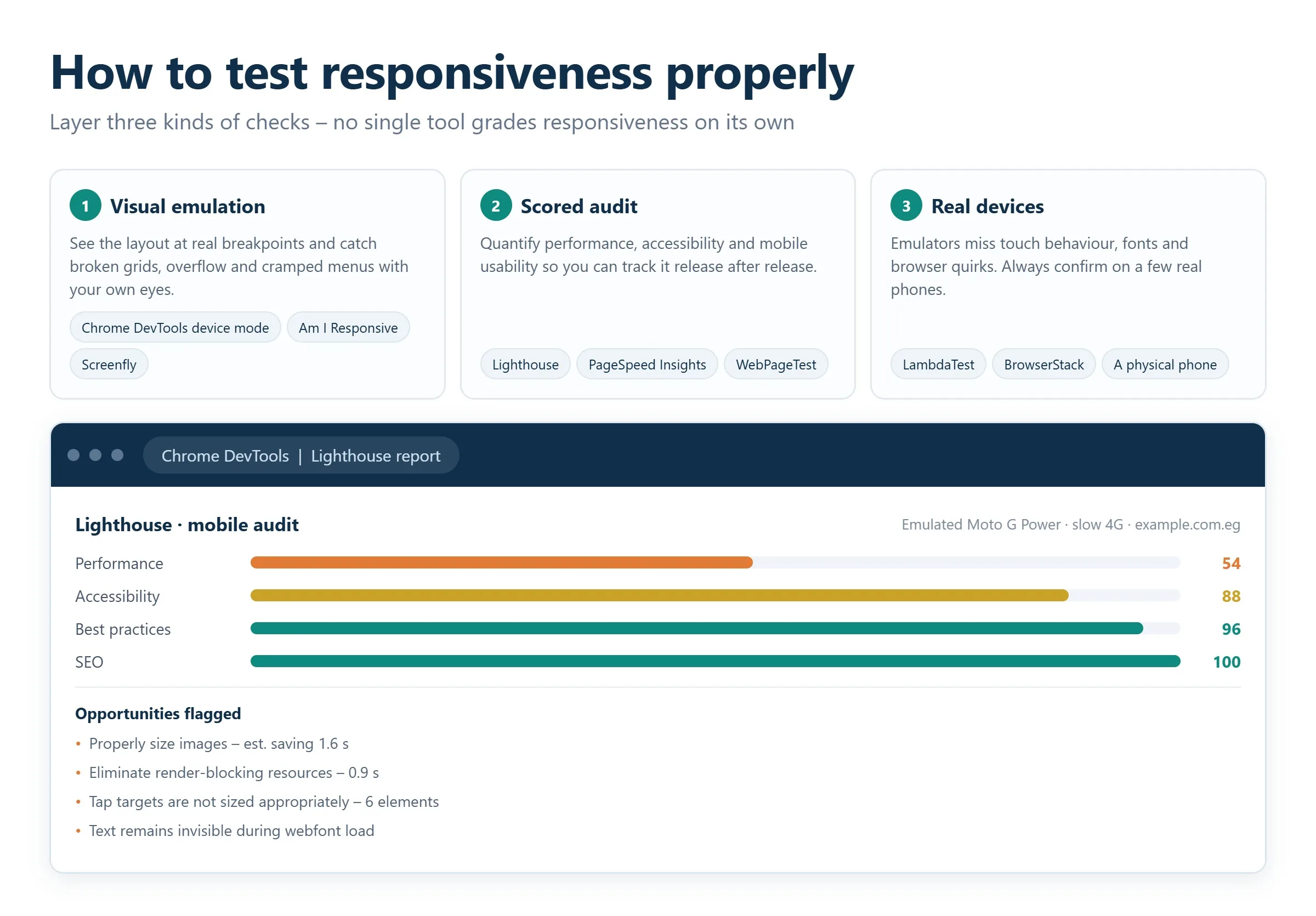
There is no single button that grades responsiveness perfectly, so the reliable method is to layer three types of checks: a visual emulation to see the layout, a scored audit to quantify performance and mobile usability, and real-device testing to confirm behavior in the wild. The tools below cover all three, and most of the essentials are free.
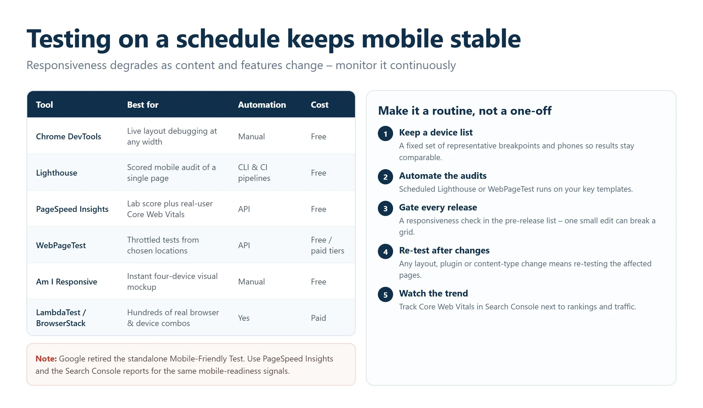
Chrome DevTools device mode
The browser you already use is the quickest way to start. Open your page in Chrome, press F12 to open DevTools, then click the device-toolbar icon (a small phone-and-tablet symbol). You can pick preset devices such as an iPhone or Pixel, enter custom dimensions, rotate the orientation, and throttle the connection to simulate 3G or 4G. Firefox offers an equivalent Responsive Design Mode, and Safari and Edge include their own emulators. Device mode instantly exposes the most common defects: horizontal overflow, overlapping elements, and menus that fail to collapse.
Google PageSpeed Insights
PageSpeed Insights is one of the most important free tools for mobile readiness. Enter a URL and it returns separate mobile and desktop reports built on Lighthouse and real-world Chrome User Experience data. You get Core Web Vitals, a performance score, and specific, prioritized recommendations such as compressing images, deferring unused JavaScript, or fixing layout shift. Because it reflects how Google actually measures mobile experience, it is the closest replacement for the retired Mobile-Friendly Test.
Lighthouse
Lighthouse is the audit engine baked into Chrome DevTools under the Lighthouse tab, and it also runs from the command line or CI pipelines. It scores four areas: performance, accessibility, best practices, and SEO. Running it in mobile mode gives you a thorough technical snapshot of a single page, and because you can automate it, it is ideal for catching regressions before they ship. For teams that want these checks wired into their release process, our technical support team can integrate automated Lighthouse runs into your workflow.
LambdaTest
LambdaTest is a cloud platform for cross-browser and cross-device testing. It lets you open your site on hundreds of real browser and OS combinations, capture full-page screenshots across many screen sizes at once, and run automated visual-regression checks. Its AI-assisted features flag mismatches between versions of a page, which is valuable when you push frequent design updates. It suits agencies and product teams that need broad coverage without maintaining a physical device lab.
BrowserStack
BrowserStack offers interactive testing on thousands of real devices and browsers hosted in the cloud. Instead of emulating a phone, you drive an actual device remotely, which reveals rendering quirks, touch behavior, and performance issues that emulators simply cannot reproduce. It is the gold standard when you need certainty that a checkout flow or interactive component works on specific hardware your customers use.
Responsively App
Responsively is a free, open-source browser built for developers. It displays your site in multiple device frames side by side in a single window, and interactions such as scrolling or clicking mirror across every preview simultaneously. That makes it fast to spot where a layout diverges between a phone, a tablet, and a laptop. It is a favorite during active development because it tightens the feedback loop dramatically.
Am I Responsive
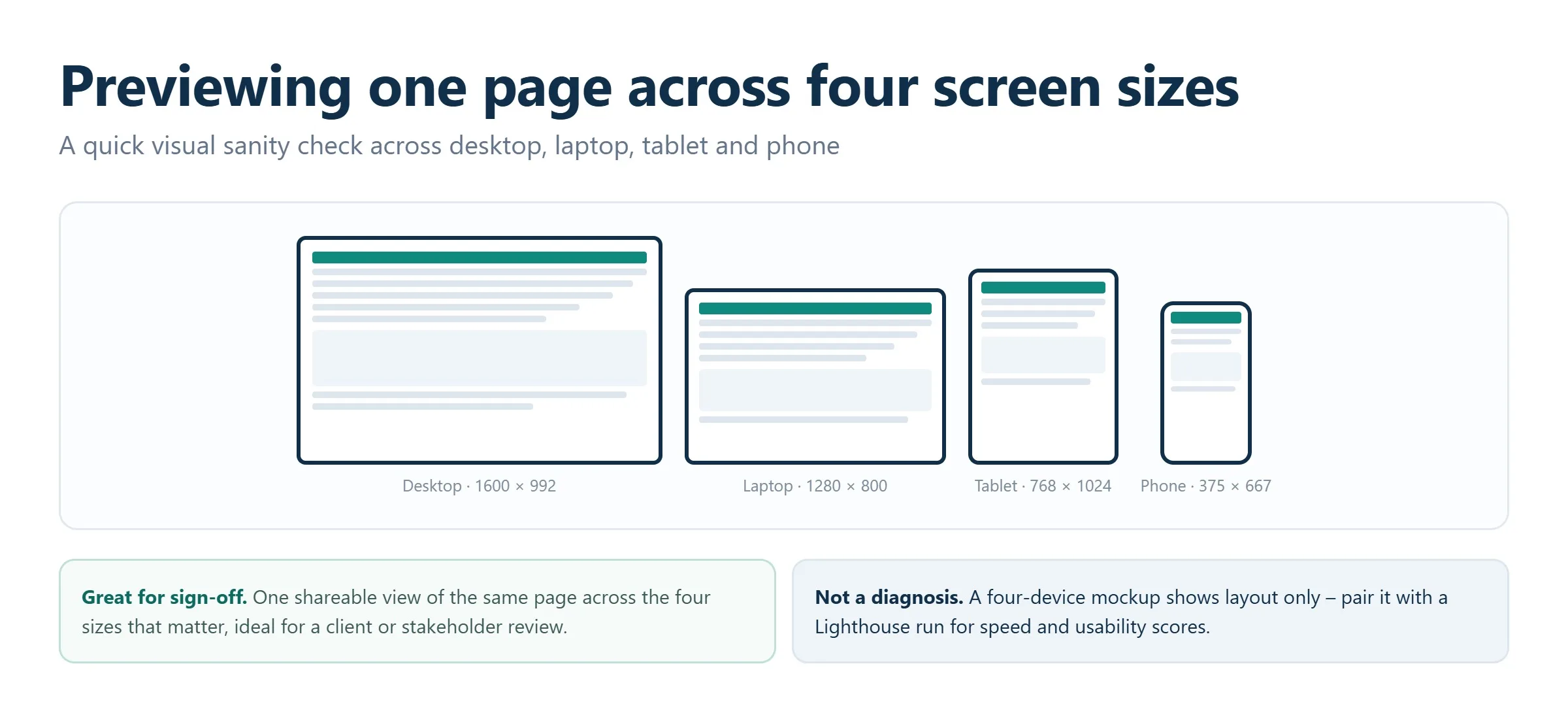
Am I Responsive is a lightweight visual tool that shows your site rendered across four standard device sizes on one screen: desktop, laptop, tablet, and phone. It does not diagnose performance, but it gives designers and stakeholders an instant, shareable mockup of how a page presents across common breakpoints. It is perfect for a quick sanity check or a client presentation.
Screen sizes and viewport testers
Simple viewport tools such as Screensiz.es, Screenfly, and similar utilities let you preview a URL at specific resolutions and device profiles, switch orientation, and even simulate TVs or wearables. They are handy for confirming behavior at a precise breakpoint you are debugging, and they require nothing more than pasting your link. Keep one bookmarked for rapid, one-off checks.
Performance suites that also check responsiveness
Some platforms combine several test types in a single report. GTmetrix grades load speed by device and region and offers concrete optimization tips. WebPageTest delivers granular waterfall analysis of how resources load across different networks and devices, exposing exactly what slows a page down. Both complement the visual and audit tools above when speed is a core concern for your responsive pages.
How to diagnose and fix responsiveness issues
When a page fails a responsiveness check, work through the problems in order of impact rather than fixing whatever you notice first.
Diagnose the root causes
The usual culprits are a missing or misconfigured viewport meta tag, absent or incomplete media queries, fixed-width elements that force horizontal scroll, images without responsive sizing, tap targets crowded too close together, and heavy scripts that drag down mobile load times. DevTools device mode and PageSpeed Insights will surface most of these quickly; the console and the coverage panel help you find bloated or unused resources.
Prioritize fixes
Start with critical bugs that stop content from displaying correctly on phones, since those cost you visitors immediately. Next, address performance issues that hurt Core Web Vitals. Finally, refine visual polish such as spacing and typography. This order protects rankings and conversions while you work through the backlog.
Apply technical solutions
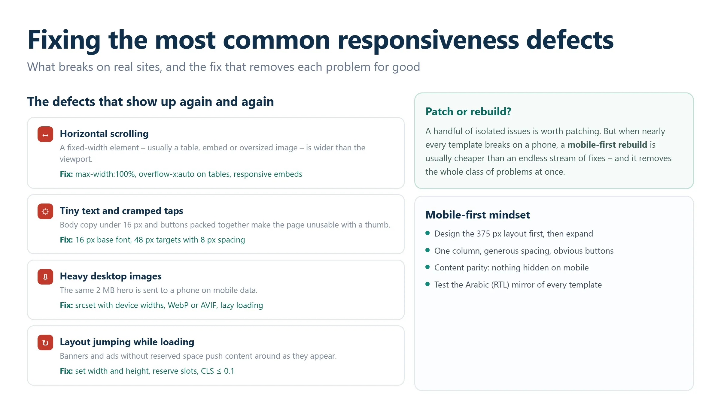
Practical fixes are usually straightforward. Confirm the viewport meta tag is present and set to width=device-width, initial-scale=1. Add or correct media queries so layouts adapt at your key breakpoints. Adopt a responsive framework such as Bootstrap or Tailwind if you are building from scratch. Compress and convert images to WebP or AVIF, and serve appropriately sized versions with srcset. Enlarge buttons and spacing for touch. When defects are pervasive, a targeted redesign with a mobile-first mindset is often cheaper than patching endlessly. If your site runs on WordPress, our WordPress development team can rebuild themes to be responsive by default, and for bespoke projects our custom web design service bakes responsiveness in from the first wireframe.
Test on a schedule, not once
Responsiveness degrades over time as content and features change, so make testing routine. Maintain a checklist of representative devices and breakpoints, automate Lighthouse or WebPageTest runs against key pages, and add a responsiveness check to your pre-release process. After any layout change, re-test the affected pages, because even a small edit can break a grid. Ongoing monitoring is what keeps mobile performance stable, and it pairs naturally with a broader SEO services program that watches rankings and traffic alongside technical health.
Frequently asked questions
Is the Google Mobile-Friendly Test still available?
No. Google retired the standalone Mobile-Friendly Test tool and its associated API. To get the same mobile-readiness signals, use Google PageSpeed Insights and Lighthouse for scored diagnostics, and Chrome DevTools device mode to inspect the layout visually. These tools reflect exactly how Google evaluates mobile experience today.
What is the difference between responsive design and a separate mobile site?
Responsive design uses one URL and one codebase that adapts to any screen size through fluid grids and media queries. A separate mobile site is a distinct version, often on a subdomain, that serves different code to phones. Responsive design is now the recommended approach because it is easier to maintain and consolidates your SEO signals under a single URL.
Which free tools should I use to run a website responsiveness test?
Start with Chrome DevTools device mode to see the layout, then run the page through Google PageSpeed Insights and Lighthouse for scored performance and mobile-usability feedback. For a quick multi-device visual, Am I Responsive and the Responsively App are both free. This combination covers visual, technical, and performance checks without any cost.
How often should I test my site for responsiveness?
Test after every significant design or content change, and run automated checks on your most important pages as part of each release. Because a small edit can break a layout at one breakpoint, treat responsiveness as ongoing monitoring rather than a one-time task. Scheduled Lighthouse or WebPageTest runs make this practical.
Does responsiveness really affect SEO rankings?
Yes. Google uses mobile-first indexing, so it ranks your site based on how the mobile version renders. A responsive site that loads fast and displays cleanly on phones performs better in search, while a broken mobile layout raises bounce rates and drags down rankings for all users, including those on desktop.
Related guides
Don't miss the chance to
make your website more visible!
Initial consultation and
audit of the current situation

Read also

Article Behavioral Factors in SEO: What They Are and How to Improve Them
Article JavaScript Links Are Hiding MENA Sites From ChatGPT and Claude

Article VOCTOS Is a Top SEO, PPC and SEM Company in Egypt on Clutch for 2026
Article Commercial Ranking Factors: The Complete List

Article The Title Meta Tag: What It Is and How to Write It
Article The Role of Meta Tags in Search Engine Optimization
Article Can You Sue an AI for Defamation? Where the Law Stands

Article Cloudflare’s 15 September AI Crawler Defaults: The Check Gulf and Egypt Brands Should Run Today






Real Results
More Wins
SEO & GEO for Delta Medical Labs
 GEO
GEO
1M+ monthly organic visits, 159,200 ranked keywords, 5,570 pages cited by AI engines, and 1,186 #1 rankings in KSA.

Arabic SEO, GEO & guest posting for VPNly
 SEO
SEO
65K peak monthly organic visits, 55 guest posts, and 149 pages cited by AI engines.

SEO & GEO for Ogaei Virtual Care
GEO
From 3 to 7,931 monthly organic clicks in 7 months, 2.9M+ impressions, and 40+ keywords in Google’s Top 10.

SEO for Eduverse
SEO
12× search traffic in 10 months, 45% of target keywords in the top 5, and 55% in the top 10.
Trusted by